Turning your business vision to life
with considered meaningful design

Explore what I make and how I work. Get in touch if you’d like to work together.


Selected works

Please email us to request a full portfolio of my work.

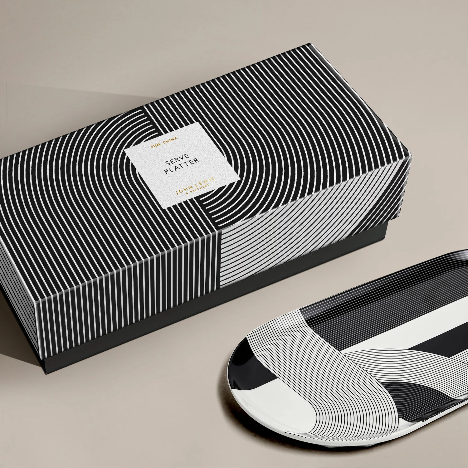
Packaging for reusable candle vessels


A striking bold gifting range created with Bryson Loxley was developed for John Lewis & Partners’ own brand stationery, games, tableware and home fragrance products. Product are made with sustainable and/or FSC certified wood, recycled paper and leather. The home fragrance ceramics are designed to be reused as vases after initial use.

 
jlp_giftscollection_teapots.jpg
jlp_giftscollection_tray.jpg
jlp_giftscollection_groupsqr.jpg
jlp_giftscollection_boxesstacked.jpg

Board games pattern design


We collaborated with Bryson Loxley to create John Lewis & Partners own premium classic boardgames collection. Unique print designs were developed for individual boardgames inspired by their game pieces.


Luxury packaging & chocolate illustrations


Collaboration with Bryson Loxley on creating John Lewis & Partners Masterbrand gift food scheme. The packaging needed to be desirable, beautifully designed, giftable, convey a premium quality and communicate the story behind each chocolate flavour to feel rare and surprising. The confectionery boxes housed contemporary culinary chocolates and menu inserts illustrated by Grace.


jlp_chocbox_illustrations.jpg
jlp_chocbox_closeup.jpg
jlp_chocboxes_group.jpg
jlp_chocbox_open3.jpg
jlp_chocbox_open2.jpg
JL_tissuepaper.jpg

Skincare branding & packaging


The name, identity and packaging was created for a Canadian skincare brand. The scent of each product is signified by an icon with a minimal clean design that represents this all-natural skincare range.

 
rinse_lineup1.jpg
Rinse_Lineup2.jpg
Rinse_Water-sachets.jpg

Luxury packaging & chocolate illustrations


Limited hardcover book design, in collaboration with Bryson Loxley, were delivered to a small group of elite figures, inviting them to join a new exclusive Yacht Club, part of Corinthia Hotel in Doha. Highly tactile premium finishes and paper stocks were featured throughout the book.


Brand identity design


for independent family photographer, Anna Richards. The identity was inspired by her son’s love for the moon, stars and sky colours at dusk.

Logo, illustrated textures and icons were created for digital communications and printed stationery.


The Assembly global events


An extensive brand identity system for a series of annual events across the globe hosted by ACAMS Org, an anti-money laundering organisation.
The master identity, The Assembly, was developed to house and co-exist alongside individual locations represented by letters w bespoke designs and illustrations, demonstrated here with Hollywood, Florida.

Digital promotional communications, environmental signage, merchandise and printed brochures & handouts was created for individual event sub-brand.

Letter illustrations by Grace Chao and Caro Gates.


Crypto anti-money laundering programme


An identity design for certification course on Crypto anti-financial crime for ACAM Org.
A suite of minimal graphic illustrations and animations reflected the fast-moving behaviour and volatility of Cryptocurrency.


Sanctions Programme


A visual identity was created for an ACAMS Org. educational programme lead by counter-terrorism experts on the topic of global sanctions. The identity represents the continuously changing landscapes of sanction regulations and the challenges it faces with global current events.  

Digital podcast icons and online promotions were created, as well as collage-style illustrations for editorial papers on the different topics of sanctions covered by the programme.


Brochure design for a youth campaign


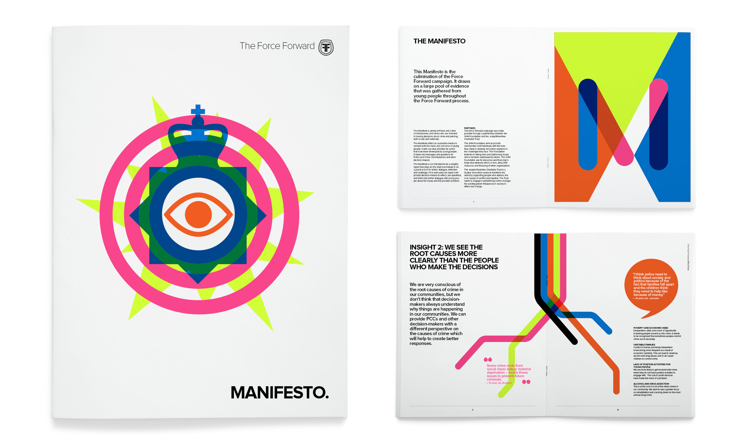
Written by a youth organisation in the aftermath of London police riots in 2011, this manifesto was sent to police commissioners and local MPs to raise issues of the stigmas of young people that are associated with crime, and to create a better relationship with the police in order to improve the safety of their communities.

The overlapping icons in fluorescent police colours symbolises the aim for co-operation between young people and police communities.

 
shm_manifesto_spreads1.jpg
shm_manifesto_spreads2.jpg
shm_manifesto_spreads3.jpg